"Buddy wouldn't consider himself to be the 'Wizard'."
"Shouldn't the book be exactly as Buddy envisioned, including the cover and original title?"
Over the course of recompiling the manuscript revisions, talking to publishers and contemporary effectsmen, many persuaded us to update the cover, appealing to a new generation. Afterall, the book was originally penned for the special effects student.

The original concept of "Big Ones Out of Little Ones" carried a lot of metaphors; miniatures used in blockbuster movies, little ideas that develop into bigger concepts, and the many 'little' people that are the backbone of big business. Even the king of the jungle starts out as a pup. A bit lofty stretch for the current generation to ponder, possibly.
Buddy tested alternating red and black color schemes with varying font sizes and shapes. Exact photo layout and size were specified, as was throughout the book. Buddy's draftsman skills at work.

Keith Kaminiski, a good friend of mine and well respected Art Director, took up the challenge. "Wizard of Oz" naturally draws up quite a few iconic images; the famous poppy field matte painting, the green Wizard bust floating in front of ominous fire pots as the Wizard's alter ego floats above, the witches castle, on and on. Buddy's book chronicles his life's journey. The "yellow brick road" metaphor seemed very appropriate.


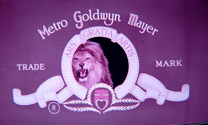
Buddy also directed MGM's logo title sequences, featuring several of the Leo the Lions, shot by his good friend, Harold J. Marzorati. This too, seemed very appropriate.
Keith took all these and more into consideration. He hand drew Buddy's bust and each element in PhotoShop. The black and white contrast, similar to the "Wizard of Oz" movie, represents the story telling of the book as Buddy takes the reader by the hand to the glory days of MGM.

Metaphors are still relevant and accessible. MGM being "Oz", and the wizards of MGM the effectsmen and craftsmen that toiled over minute details. Their subtle magic displayed proudly on screens worldwide. Yes, it may seem as if the title and cover are a bit gratuitous given the company Buddy shared with Cedric Gibbons, Donald Jahraus, Paul Irebe, and other movie magic geniuses. But this is his book. His tribute to teams at MGM. And his life lessons for us all to consider. One of a team of Wizards of MGM.
MagicImage Filmbooks announced the upcoming title in their flyer sent out in 1989. The airman photo, one of many images still missing, might be that of Floyd "Speed" Nolta.

The complete newsletter included announcements for "Mr. Science Fiction's Fantastic Universe" (available in VHS or Beta), The Gernsback Awards, And Forrest J. Ackerman's "Famous Monsters of Filmland".

